The summary panel
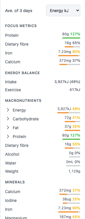
The summary panel sits beside your diary on large screens; on smaller screens, open it with the panel button at the top right. Its heading — for example, Ave. of 3 days — tells you the numbers are a daily average of the days on screen that have food entries.
Targets
The summary has three sections. Macros — energy, protein, carbs and fat as four tiles. Food groups — one tile per group, showing the serves you have eaten with the target in the tooltip, when your food database carries food group data and you have switched the group on. Targets — whatever individual nutrients you switched on, one row each with your intake, the percentage of your daily target and a progress bar. A new profile starts with the macro tiles only. Choose what appears in your profile — open Profile from the diary, select Edit next to Targets — see Set your targets. Select anything in the summary to see the detail behind it, including how your intake compares with the recommended amount for your age, sex and life stage.
Reading the bar colours
The diary shows days that are still in play, so its bars track progress rather than passing judgement:
- Purple — progress toward a target. Being under a target partway through a day is normal, so it is never coloured as a warning.
- Green — the target is met, and you are under any maximum that applies.
- Red — intake has crossed a maximum: a max threshold you or your practitioner set, a reference upper limit, or the top of a healthy macronutrient range.
Select a row and its detail dialog adds a fourth colour. Where the nutrient carries a max, the dialog draws a zone track rather than a plain bar — target and max both ticked and labelled — and the fill turns amber once intake is inside the last fifth before the max. That is not a finding either; it is the ceiling coming into view while there is still a day left to spend. Green on that track means met and clear of the max, rather than merely under it.
A nutrition report reads differently again: it judges a finished period, so there "under the requirement" is a finding and is coloured orange. Same greens and reds, but the summary bars deliberately never show orange for being short of a target — see Understand your nutrition report.
Energy Balance
Energy Balance shows your energy Intake and how it compares with your daily requirement. When you log exercise, an Exercise row appears with the energy you burned.
The full nutrient breakdown
Full breakdown › at the top of the panel opens the whole picture: your intake broken into Macronutrients, Minerals, Vitamins and Food Groups. Expand a section and select any nutrient to open its detail view.
Choose your display metric
One nutrient value appears next to every entry in your diary, and a nutrient dropdown chooses which one. It's unlabelled on screen — screen readers announce it as Diary display metric — and where it sits depends on your screen size: on large screens it's in the diary header, beside the date controls; on smaller screens it's at the top of the summary panel, above the macro cards. It's energy by default, but you can switch it to protein, carbohydrate or anything else you're tracking.
Summarise a selection
Tick the checkboxes on individual entries — or a whole group or day — and the panel switches to totals for just the selected items, so you can answer questions like "how much protein was in lunch?". Clear the selection to return to the daily view.
On Professional and Team plans, the Report button in the diary header builds a nutrition report over any date range, with a downloadable PDF.